About

Private information disclosed. Here for example use now... if anyone uses it.

Social Realism - What Is It?

Social Realism is a genre used in visual arts that has, over the years, become a very interesting source of entertainment for all sorts of audience and people; an expressive way of showing a 'slice of life'. Click here to find out more and see various examples of the genre 'social realism' in use...

Film Promotional Poster

For the latter parts of the project, one of the additional tasks me had to complete included creating a film poster to promote our short film...

Research Into Setting

Go to Blogger edit html and find these sentences.Now replace these sentences with your own descriptions.

Creating A Production Company Logo

For this group project, we felt we needed an identity or logo to represent our 'short film company'. We had already had a production meeting organizing and deciding on a name (Makley Productions) but we also felt a visual presentation of this identity would have been appropriate to include as a credit in our final piece.

First Set of Footage!

Our first pieces of our short film to capture on film were the internal shots in the house. Click here to see the very first bits of footage we captured with our Canon 55oD camera and external microphone.

Friday 22 February 2013


Thursday 14 February 2013

Evaluation Q4: How did you use media technologies in the construction, research, planning and evaluation stages?

For this evaluation, I decided to use my graphic design and artistic skills to explore my response and present it. I decided on creating various mind maps/explanation diagrams to show my response.
I needed to create some plans on how I was going to set the mind maps out though, as walking into it blind would be a very messy and foolish method of approaching the question.

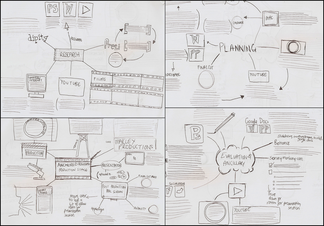
Here are my initial sketch plans for the diagrams:
And here are the final pieces to answer this evaluation question:

Research
By using the modern technologies I listed in the diagram in the research stages, we were able to gain data and research that was rich in quality and very accurate to the theme of social realism. It also saved us a lot of time to use technology rather than going out to find hard copies of research and spending ridiculous amounts of money on films and film viewing tickets.

The fact we could use YouTube and other video sources for researching films was also a great advantage for us, as it allowed us to access films easily, plentifully and appropriately as we could see from others feedback whether the film was a successful one or not.

Another factor that should be consider if that we could easily find different cultural or political based meanings through the internet easier rather than watching only physical DVD's and films, as we could simply search for exactly what we wanted and most of the time find it, enabling us to gather research and knowledge reasonably quickly.

Generally, the media we used in this section of the project was also technically research on presentation techniques, as we started to learn how we could record and nicely show our pieces of work in a nice, organized way. The more we created with these technologies, the better we got; meaning the better we will present in later stages of the project.

Planning
The planning process was quite an interesting one for using modern technologies, as it was tempting to just write everything onto a piece of paper a lot of the time. However, we found that recording our ideas and planning development on digital media put us at much more of an advantage as it allowed us to stay organised and keep our plans tidy and easily accessible for later reference throughout the project (specifically production stages).

New digital technologies were also a brilliant way for us to store any information we needed or created. As well as being easy to upload and create online documents on websites such as Scribd and SlideShare, it allowed us to easily view and improve on our pieces, whether they be a written document or a video source. We could easily access them to see if we needed any improvements in either the actual planning content or the presentation of our ideas. It also helped us experiment with creating videos more as we could physically create our own videos containing plans and ideas rather than just embedding film files from other users like we had done in previous research stages. (E.g. Research into Environments of the Real World)

Production
The production stages was easily the stage that required the most use of new media technologies. This ranged from hardware to software to websites and social networking, all of which created a, in my opinion, really well structured production process.

By using all of these modern pieces of technology, we were able to create a modern, easily accessible and great quality product that easily looks like it was built within a professionally industry standards. By this I mean that all technology that was used was similar, if not the same as, to what professional media or film production companies use with their own products. This made our project seem extremely authentic.

Also, by creating a good, realistic short film and production process  it would allow us to create great quality evaluation points, as well as being able to sync our ancillary tasks with great accuracy. We would also be able to use any skills we had gained from technology used in this stage, as well as the previous, to create the future ancillary tasks and evaluation responses.

Evaluation & Ancillary Tasks
The ancillary tasks were primarily built from a program that is of industry standard; Adobe Photoshop. This program was used to create the poster and magazine review as it allowed us to use our artistic and creative skills as best suited to the products we had to create. When we were researching examples of these pieces, we would use other presentation techniques such as Powerpoint (uploaded to SlideShare) and Prezi presentations to present the research we had gained. Because we had previously used similar presentation methods for our very first stages of research, we created the ancillary task presentation pieces very quickly, as we had already developed a good knowledge on how to use the software and programming.

The evaluation tasks had to involve use of technology in order to stay interesting and informative to a reader. Media technology was especially great for presenting our pieces of work for this section. Once we had all the content we needed written down somewhere (such as on Word or paper), we could use our newly acquired skills from practising with the media technologies previously and easily copy and paste or import and apply the content we needed into these presentation techniques (such as YouTube videos or Prezi presentations), creating very interesting, and in some cases interactive, records and presentations.


Blogger and Wix were also pieces of technology that were used for this project; to present any content we created in a blog format. Katie and I used an advanced blog layout on Blogger, whereas Matt used Wix. These sites allowed us to create posts and pages, embed content (such as YouTube videos, SlideShare presentations and Behance portfolio pages) and create nicely set out pieces of text and presentation. We gradually learnt how to better control and use these blogging format sites as time went along; learning how to align text better and import and place images clearer for example.

So, on an overall view, I found the use of modern and new technology went hand in hand with our project and really enhanced the quality of any pieces of work we produced; whether it were research, editing or anything else the project involved.

Evaluation Q3: What have you learned from your audience feedback?

I created a Behance portfolio presentation to explore this question. You can view it on the link below:

Evaluation Q2: How effective is the combination of your main product and ancillary texts?

Here is a Prezi presentation, which was created by Matt, to explore and answer this evaluation question:


Overall, I think that we did a great job with creating the ancillary tasks to go alongside and work in synergy with our short film. If we were an industry, we would be using the film poster to advertise our films in various places such as cinemas and bus stops (as already researched before) and the magazine article to get our film and its contents out there for the public to read about. These pieces of media would aid our short films sales, promotion and overall excitement if it were an industry standard project, as advertising it needed to get anything promoted in this modern age.

I really love the fact that all of our pieces of media match and look right together; all fitting a certain style and theme that we ourselves have created. They all hold similar features, which make them instantly identifiable of being related to each other. It's also a lot more professional to keep to a theme/style. You want you're products to link together rather than lead their own single parts. I think they all link very well, making them a success!

Evaluation Q1: In which ways does your media product use, develop or challenge forms and conventions of real media products?

In order to get my point across on how my project used and challenged typical conventions and themes in the social realism film idea, I decided to create a video to explain some big examples of how we used them.


Another note I would like to add is how we used people and directors as influence. We didn't directly copy anyone from the industry, as we felt this really limited our creativity and didn't allow us to challenge the ideas enough for our film. We wanted to create a piece that was no where near as dramatically led as most other social realism films. By this we mean that from our analysis's of already existing social realism based films, the stories and characters were still very dramatic in our eyes, involving themes like drugs, knife crime and gang culture. Although this IS seen in our reality, it's not exactly a prominent part of it and problems tend to be and end up being dealt with a lot less dramatically as these social realism films did.

Our topic in our film revolved around running away from home due to an abusive, neglected  broken family lifestyle which is considered normal for a social realism genre based film. We made sure to constantly think of how Ken Loach would approach this issue throughout our production as he has a lot of experience in films with this topic. However, we approached the results and solutions to this problem a lot differently. Most social realism films would have presented the main character running away and getting involved with horrible situation such as muggings, fights, drugs and other anti-social behaviours, to express their emotions and frustration during their point of crisis. We, however, felt this to be far too dramatic, considering the fact that in reality, teenagers who run away, in a middle/working-class lifestyle, usually returns, quite quickly too, due to the fact they realise they cannot handle being homeless or miss their family, 'dealing with the cards they were dealt'.
I feel we created a much more realistic theme in the theme by doing this rather than going down the dramatic route.

Wednesday 13 February 2013

Final Piece: Anchored Renegade

Our video was then edited to the best quality it could be and a final cut was produced. The video below is our final short film product. It was uploaded to YouTube at full 1080p HD quality. Enjoy!


Using a website called Animoto, I created a 30 second long key frame compilation slideshow using the websites slideshow creation and hosting services. I would have made it longer, how to do so with the software I would have had to purchase a premium membership, which wasn't worth for the 10 pictures I had and on our student budget.


Wednesday 6 February 2013

Final Film Poster

This is our final promotional film poster.


I also printed this poster of in real life to envision what it would look like on a wall in reality. I didn't have access to any A2 paper, which is what film posters would usually be printed on, so we had to make do with A3. But, we think it still looked really legitimate and authentic, as well as felt proud of our product (although we know it would have looked a lot better at an A2 scale).


Here is my evaluation notes of the promotional poster product:

Overall, I feel that by creating this promotional poster, it would attract lots of potential viewers to our film and it would definitely benefit our films popularity and knowing amongst members of the public. Film companies and directors create these promotional posters to get their new films out in the world and have its name recognized, rather than letting it be released without anyone having prior knowledge of its existence. It's kind of like having a prior warning or announcement for the films release basically.

Also, if film posters and other similar advertisements didn't exist, people would find it extremely hard to have motivation or desire to go see films in cinemas or buy them on DVD or digital copy etc, as they would have no prior knowledge on what style or ideas are within the film at all, thus making it impossible to predict what the film will be about in any other way other than going straight to watch it. This would also cause quite a big risk review wise, as if people didn't know what it was about, made effort and paid to go see it, then hated it, they would display this dislike. This could be avoided by giving them a prior advertisement so they would know before whether they would like the film or not.

I think what I created was quite successful and looks very realistic as a social realism based poster. I think it would definitely boost the promotion of the film and give a very clear idea about the themes and styles in film, as we can clearly see from the poster that the film is set in quite grungy and negative tone. It's also, thanks to the bold lettering and colour contrasts between the text and image, stands out very bold and is easily noticeable  catching lots of eye attention. I'm quite proud of this piece.

Monday 4 February 2013

Creating A Film Poster Advertisment

Using Behance, I created a small portfolio page to present the creation process of our groups film poster. You can see the progress shots of the posters' creation here, so click the link below to view:

Click On This Link Please!

Sunday 3 February 2013

Inital Font Ideas For Film Poster Advert

One of the main aspects of a film poster is to have the film’s title on the piece of paper, often taking up a third of the page. I decided to design and test some fonts and see which I thought suited the film’s genre and themes better. Factors such as capitalizations, weight and kerning need to be considered during this design process.

The images below show the different font ideas I explored, through own hand-drawn designs to similar or own created digital versions.

From the research and exploration I have been doing, we think that a sans-serif, bold, capitalized font would be the more appropriate type of text design to use. However, we will test with the others during the posters production to see if any of the others end up suiting it a lot more than we expected.

Size is also another big part of font and poster design! Film titles need to be the primary source of information to the viewer, alongside the imagery. In order to make sure it's 'first bit to see'/primary status is shown, the title needs to be big and catch the viewers attention. It also shouldn't blend too much with the imagery or it may go unnoticed.
I decided to create some sketches to explain what I mean by how size can impact the success of a poster...
From these sketches, we can clearly see that some of the pictures do not even look like they have a title until you start wandering around the page to find it. This is NOT a good technique for advertising a film, as people need to know to films name within the first few seconds of seeing the poster in order to be interested. Without noticing the title, they will walk away; thus not promoting your film successfully. I must make sure in my own poster that I create a title that is at a 'right' size.

I also started to look at the lettering style used at the bottom of a film poster, in the credits and legalities section. Regardless to the type of film or genre, they all used a similar style and followed a certain trend that seems to be automatically assigned to the credits section of any poster. Here are some examples:

Upon seeing how all film posters follow a very similar trend (minus the colour schemes and specific font names), I realised I had to use this style in my teams own short film poster. Using these images as reference, I searched the internet to find a font that is similar to the ones used in actual film posters. The features/style I would be looking for were tall, thin and capitalized letters. I found a font and experimented with it to see if it would look accurate to a real poster. I made sure to include 


Photography For Film Poster

As we didn't want an illustrated film poster, due to the fact it would be silly to have a social realism film advertised in an unrealistic manner, we needed some photo's to work with and create it with. Below are the shots that we took as possibilities for our film poster.


We also had one more shot, which we decided was the one we wanted to use. It can be seen below.


We liked it because of how dirty and rough it looked, which matched our films theme and idea of homelessness perfectly. We also just really liked the composition in general. This was actually an accidental shot that was taken, as we had meant to be recording video footage for our film rather than taking a picture. However the out of focus blur and the general structure of the picture actually looked really nice; catching our actor at a natural, random moment where he was playing the character's role.

Creating Logos For The Film Poster

One of the other features we noticed during our analysis of film posters was that there were a sufficient amount of associated companies and sponsors in the credits section at the bottom of the poster. These companies were all represented by logos. These seemed to be an essential for a film poster in order to look authentic and professional. It's almost as if it's a boast to credit all the featured companies that were worked with.

Instead of stealing other companies logos or using resources that were not our own, we decided creating our own fictional company logos would be best. We first created a collage of existing logos that are usually found on film posters in this credit section we speak of.


From these logos, we could see the typical designs and styles of them, such as the fact that they all following a single colour palette that is designed to stand out from the background (particularistic white on black and black on white).

I then began to design my own fictional designs.
I uploaded a Powerpoint Presentation to Authorstream to show my logo designs.

Creating Content For The Film Poster

Once we had done all of our research for our posters' content, I set to creating the content. You can see the content that we created for the poster in this Google Document:

Click This Link To View The Document!


Saturday 2 February 2013

Initial Design Sketches For Film Poster

The first part to creating an advertisement for a film in poster format is to create and sketch ideas for the piece. By doing this, I can create a rough plan on how the short film will be advertised, following the themes and conventions that I had researched previously. We had already taken some photography from our shooting sessions, so I could work on designs from them.

In this image, I explored the pro's and cons to using landscape or portrait layouts for posters, as there are subtle differences in what each type suits.

After putting the canvas layout into consideration and once we had a sufficient amount of research and references, I began to sketch ideas for a poster.
Initial Design Sketches
Our group then discussed the ideas that had been created, all based from photography we had already gathered and taken before, and made a decision on which we thought would be the best and most appropriate to use for our film poster. This was our final choice.
Final Design Sketch
We chose this design because there was something about it that really stood out to us. They layout of the piece seemed right for what we needed in our promotional poster product. We also liked how the picture was taken; using a low angle made the picture seem dramatic. We also felt it matched all other aspects and criteria we needed for a poster, such as the landscape layout, room for text, non-focus on any variables at all other than our actor and the fact he is all alone in a dark area. Something about the image was also very photogenic and appealed to us immediately decided to use this idea.

Film Poster Research

In order to gain an idea on how typical film posters look, we had to do some research. We didn't want to waste time researching random film posters and felt our time would be best spent researching posters for films in social realism genre. This was so that when it came to creating our own poster, we would know the norms of a social realism genre based film in particular  rather than researching other genres such as genre or romance which may lead to us being influenced by themes and styles that do not match our film type at all.

Katie created a presentation to show our research process and what we had concluded, as results, from our research on social realism film posters.


Poster Analysis from KatieeBeth

I also created some analysis' of my own to add to our research.


Friday 1 February 2013

Film Poster Advert

The second ancillary task we had to complete was a film poster that would advertise our short film. Poster design is a very creative process, so I feel we can show a lot of our creativity during this process and will also enjoy doing it, thus putting us at a good chance of creating a great result product for this task. 

Promotional (or teaser) posters are a very common form of advertisement for moving footage media pieces in this modern day and age, being placed and viewed from a variety of different places such as cinema walls, bus stops, buses themselves (in a banner form), schools, streets and more. They may also appear on digital formats such as websites or moving image advertisements.
These posters are very commonly used to advertise newly created and released films, particularly for films expected to be released in under a year’s time, rather than films that were released quite a while ago. They are usually of an A2 or larger size and are very bold, with the intentions of catching a viewers or passer-bys attention. 

By creating a film poster, we will be able to promote our film via a media that involves a lot of creativity and artistic aspects. In order to correctly and successfully create a poster with a good synergy to our film, we must make sure it fits the themes and style of it. Without the similarities, the poster could end up looking like it is promoting a completely different film.

Here is a collage (which I created in Photoshop) of some examples of film posters.