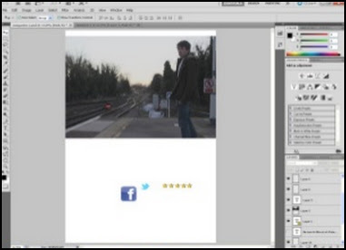
We assigned Matt to be in charge of the designing and overall creation of the final article piece. He gathered all of the research that had been done and any resources we had for him to use on his poster and got to work. He used Adobe Photoshop CS5.5 for his piece.

Matt firstly focused on placing the main elements and layout on his digital canvas so that he knew exactly where to place any other resources or design needed. He would then place any content resources I had previously written onto his design and adapted it to look professional authentic and overall suited to a magazine article design, as well as looking suited to the social realism genre by keeping the design simple yet bold and making a statement.
Rather than just creating the article at home and not bothering to record his steps, he decided to take screenshots of his work in progress up until completion. This allowed Katie and I to see exactly what he had gotten up to and to see if he really did follow the trends, styles and steps needed to creating an authentic magazine article, like the ones we had previously researched.
He put these screenshots into a PowerPoint presentation and uploaded this to SlideShare to share with his group and audience.
Screen shots of magazine process from Matt Martyn
You can see our final magazine film review article product here:
Click this link!
You can see our final magazine film review article product here:
Click this link!


0 comments:
Post a Comment