One of the main aspects of a film poster is to have the film’s title on the piece of paper, often taking up a third of the page. I decided to design and test some fonts and see which I thought suited the film’s genre and themes better. Factors such as capitalizations, weight and kerning need to be considered during this design process.
The images below show the different font ideas I explored, through own hand-drawn designs to similar or own created digital versions.
From the research and exploration I have been doing, we think that a sans-serif, bold, capitalized font would be the more appropriate type of text design to use. However, we will test with the others during the posters production to see if any of the others end up suiting it a lot more than we expected.
Size is also another big part of font and poster design! Film titles need to be the primary source of information to the viewer, alongside the imagery. In order to make sure it's 'first bit to see'/primary status is shown, the title needs to be big and catch the viewers attention. It also shouldn't blend too much with the imagery or it may go unnoticed.
I decided to create some sketches to explain what I mean by how size can impact the success of a poster...
From these sketches, we can clearly see that some of the pictures do not even look like they have a title until you start wandering around the page to find it. This is NOT a good technique for advertising a film, as people need to know to films name within the first few seconds of seeing the poster in order to be interested. Without noticing the title, they will walk away; thus not promoting your film successfully. I must make sure in my own poster that I create a title that is at a 'right' size.
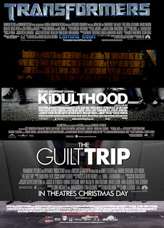
I also started to look at the lettering style used at the bottom of a film poster, in the credits and legalities section. Regardless to the type of film or genre, they all used a similar style and followed a certain trend that seems to be automatically assigned to the credits section of any poster. Here are some examples:

Upon seeing how all film posters follow a very similar trend (minus the colour schemes and specific font names), I realised I had to use this style in my teams own short film poster. Using these images as reference, I searched the internet to find a font that is similar to the ones used in actual film posters. The features/style I would be looking for were tall, thin and capitalized letters. I found a font and experimented with it to see if it would look accurate to a real poster. I made sure to include


0 comments:
Post a Comment