About

Private information disclosed. Here for example use now... if anyone uses it.

Social Realism - What Is It?

Social Realism is a genre used in visual arts that has, over the years, become a very interesting source of entertainment for all sorts of audience and people; an expressive way of showing a 'slice of life'. Click here to find out more and see various examples of the genre 'social realism' in use...

Film Promotional Poster

For the latter parts of the project, one of the additional tasks me had to complete included creating a film poster to promote our short film...

Research Into Setting

Go to Blogger edit html and find these sentences.Now replace these sentences with your own descriptions.

Creating A Production Company Logo

For this group project, we felt we needed an identity or logo to represent our 'short film company'. We had already had a production meeting organizing and deciding on a name (Makley Productions) but we also felt a visual presentation of this identity would have been appropriate to include as a credit in our final piece.

First Set of Footage!

Our first pieces of our short film to capture on film were the internal shots in the house. Click here to see the very first bits of footage we captured with our Canon 55oD camera and external microphone.

Thursday 31 January 2013

Final Film Review Magazine Page

This is the final piece for our first ancillary task, a magazine film review article.


I personally think Matt did an excellent job with creating an authentic magazine film review! It all looks very realistic and appropriate for a magazine article to be about. He followed all the of guidelines and research aspects that we had previously researched and created a great piece.

One of the aspects I noticed had a strong point and build to it was Matt's focus on and use of fonts. I really love all of the fonts he chose, along with all the sizes and styles. They all match exactly what we had researched previously and looked really great in our product, which is great for looking professional and authentic.

I also really liked his colour palette of the article. Just using a simple black, white and red colour scheme was very bold and provided the idea of simplicity; which is what our film is about in some aspects. The colours were also not too bright or suggestive of any ideas that we didn't want to represent our film with. For example, if he had coloured the page bright pinks with purples and yellows, the page would have looked very stereotypically aimed at females, which is not our aim. By using the palette he did, we could aim at all ages, genders and classes due to its simple nature.

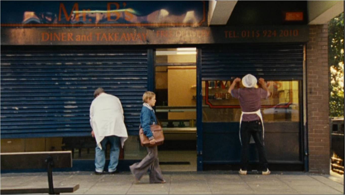
I do however think the photo that was used was edited a little too much. Apparently, Matt received a criticism that told him to lighten the picture a little bit because it was 'too dark' for the page. However, I feel it has either been lightened a little bit too much or didn't need any manipulation in the first place. Luckily though, it still looks like it fits on the page so it wouldn't prove much of a problem if it were a real article.

Matt also came across a technical difficulty during the production of this piece. As he was placing and organising the content text, he found that there wasn't enough textual information to fit in the columns. He didn't want to just change the size of the font to a bigger one to allow it to stretch and fit because he felt it didn't look like a real magazine article then, as they usually follow a same 'copycat' or default style and size when it comes to font. So, he created a little more content for the article and tried to keep it sounding accurate to the rest of the text. The fact that it is barely noticeable where he added more texts suggests he followed the research, themes and style of the text perfectly, meaning there would be no trouble with the final piece.

Overall, I think the magazine review is very accurate to what would realistically be posted within a film based magazine. It matches the typical conventions of other magazine review articles, particularly ones about social realist films, and looks like it would promote our film quite nicely. I do not mean the content itself, but the whole presentation of the film throughout design and the fact there is LOTS of information would definitely boost the films popularity and overall success.

Monday 28 January 2013

Creating A Film Review

We assigned Matt to be in charge of the designing and overall creation of the final article piece. He gathered all of the research that had been done and any resources we had for him to use on his poster and got to work. He used Adobe Photoshop CS5.5 for his piece.


Matt firstly focused on placing the main elements and layout on his digital canvas so that he knew exactly where to place any other resources or design needed. He would then place any content resources I had previously written onto his design and adapted it to look professional  authentic and overall suited to a magazine article design, as well as looking suited to the social realism genre by keeping the design simple yet bold and making a statement.
Rather than just creating the article at home and not bothering to record his steps, he decided to take screenshots of his work in progress up until completion. This allowed Katie and I to see exactly what he had gotten up to and to see if he really did follow the trends, styles and steps needed to creating an authentic magazine article, like the ones we had previously researched.
He put these screenshots into a PowerPoint presentation and uploaded this to SlideShare to share with his group and audience.

Screen shots of magazine process from Matt Martyn

You can see our final magazine film review article product here:

Click this link!

Sunday 27 January 2013

Photography for Magazine Article

From the research we had done on film magazines and their review sections, we knew we had to include at least one photo in to our media piece in order for it to look authentic. So, on one of our shooting days, we wandered up the stations tracks a little bit and spent half an hour taking some really nice photo's that we could possibly use for this ancillary task in particular.

We took photo's at a few different angles and distances to give us a variety of different compositions that we could use for this ancillary task. These shots include low angle shots looking up on the main character, long distance shots to include the background and mid shots to catch both the characters emotion and environment  Although we liked all of the shots, we decided we liked the one below most and are thus going to use it as our film's representative imagery in our magazine review article.


We really liked it because whilst it looked very professional and dramatic looking, it also looked quite dull and had a certain dirtiness to it that a social realist film needs to be advertised with. This may have been due to how the character and his clothing blended well with the environment around him. We also really loved the  train lights in the background. In a more 'in depth' view, we suggested that the lights represented freedom or a better life, which is what our character is seeking. We really liked how this imagery portrayed this point.

Saturday 26 January 2013

Creating Film Review Content

One of the main features that are required in a magazine review is textual content. Without that, unless it is a poster or images relating to a previous piece of text, the page you have is of no use what so ever and has no purpose to it. After my research into content of a film review magazine, I took on the role of a film reviewer and created, what I would imagine to be, a realistic film review of Anchored Renegade.

I had to make sure I included all, or at least most of, the features that I had previously researched in order to create a legitimate and realistic looking review. I also had to create the content for the page's tagline, title and ratings etc, which would also be included in the magazine review's page. I uploaded my review to Scribd.com.


If when it came to creating the film review I didn't create enough content for it, we agreed that Matt (the member who is going to design and create the piece) could add additional content as long as it fit the research and style we had made before.

Friday 25 January 2013

Film Review Magazine (Content Analysis & Research)

I then decided to create an analysis and research the actual content that you would put within a film review magazine. Using Prezi, I created a presentation that shows the research information I came up with from researching various film review articles.

Film Review Magazine (Design Analysis & Research)

Design is a big part to creating a magazine page, as without it or a good design, readers will often grow bored of the content they are reading and either stop reading it or let their minds wander, not taking in the information they are being given. Also, if someone saw the blank page, it is likely no one will even attempt to read the content that lies within the page.
So, we had to come up with a design for our magazine review article. Matt decided to do a radial analysis on the design and layout of magazine review pages and upload it to SlideShare.

Film Review Magazine

Another task that we are needed to complete is a magazine article reviewing our short film.

This task would require both literature and graphical design skills to present the piece of media. It is our choice whether we review our own film as having a positive or negative impact on its audience and we must make it see as professional and authentic as possible, trying our hardest to review our film in the shoes of a reviewer.

In order to create this piece for our first ancillary task, we will have to conduct some research into typical magazine film review articles... Here is a collage of real magazine film review articles.


Sunday 20 January 2013

Second Draft of Short Film

Here is the second draft cut of our short film, Anchored Renegade. It is available at full 1080p HD quality but will be improved on at a later date.


After this draft, we gained some feedback from our teacher and decided his ideas made quite a lot of sense.

So, we set to work on focussing on the areas that needed manipulating, such as the argument audio overlays suggested. However, I felt the chaotic montage would be better placed on the train sequence, as the shots contained a lot less movement and other points of focus other than our main character than the sandwich scene. So, I decided to compremise and placed the 'mashed-up' audio here instead.

Thursday 17 January 2013

Social Media

A massive part of today's society revolves around news and updates, particularly via social media websites such as Facebook, Twitter and YouTube. These websites are used for the majority of the time for getting news and knowledge of what is going on in the world, whether it be between friends, celebrities or world events. Media companies are particular fans of these forms of websites because it allows them to stay modern and up to date, as well as gives them the ability to communicate with their audience and fans. It's a great way to advertise and promote products also.

We all decided that our film would look more authentic and be promoted a lot better if we created some pages for it via these social media forms.

YouTube would be one of our most useful social media forms as our project revolves around moving image and video, this being what YouTube specialises in and is known best for. Matt, Katie and I each created our own little media based YouTube channels and will be using them to promote any material we would like to broadcast via this website.

Here are the links to our channels:

Matt's YouTube!

Shelley's YouTube!

Katie's YouTube!

Following Facebook's step-by-step page guide, I created a simple page for our film Anchored Renegade. After I had created the basic elements (including page name, description, admins), I started to create posts that involved our film in some way or another. I then began to invite people from my friends list to like the page and promote it. We will see how many likes and fans we get by the end of our project.

You can view the Facebook page by clicking the link below:


I also started off a Twitter hash tag for Anchored Renegade. This hash tag will be visible at the end of our final video product and also on some of our ancillary tasks. Using hash tags will allow us to firstly see if we reached the Twitter audience, but also to see how promoted are film has become overall. If the hash tag spreads, it could mean big promotion for us.


Tuesday 15 January 2013

First Draft of Short Film

The first draft of our short film was then uploaded on to YouTube.


As this was only a draft, there were mistakes and cuts that we will need to fix at a later date before releasing the final project.

Afterwards we were given some feedback from our media teacher. Katie created a video to respond to the feedback.

Friday 4 January 2013

Post-Production: Credits and Titles

One of the more minor, yet still important, processes of creating a film is having sections that contain information such as the title of the film and credits. There is no definite or right way to present this content, allowing film makers to use their creative (or simplistic) skills to present the information. We had already created a very simple, scrolling upward, black and white design for the credits of the film, leaving it as a very simple design that is often used in many films.
The information in the credits were quite detailed and contained all of the roles and content that were used during the films production. The content was created in a group effort.

Directed & Produced By Makley Productions
Katie Jones
Matt Martyn
Shelley Hunter

Actors: Matt Martyn & Katie Jones
Screenplay: Katie Jones
Cinematographer/Choreographer: Shelley Hunter
Visual Edit: Katie Jones, Shelley Hunter & Matt Martyn
Audio Edit: Shelley Hunter & Katie Jones
Special thanks to TFL and STS for co-operation and permission to film shoots.

'Runaway'
Performed by the Red Hot Chilli Peppers
Produced by Rick Rubin
Courtesy of Warner Bro's Label

'New Moon'
Performed by Grizzly Bear
Produced by Chris Taylor
Courtesy of Warp Label

#AnchoredRenegade2013


With the opening title/sequence, I wanted to explore some creativity a little more. I decided to look up examples of opening sequences in films and television programs to see how they generally work and to inspire me to think of my own ideas.


I also found a really great Flash-based website which allowed me to easily navigate and view great examples of opening sequences, titles and prologues in films (as well as other media such as games). It was absolutely great for finding good and successful examples, as well as inspired me to create my own work.

Click here to see Prologue.com!

From the research on examples, I found a few common features. The title's style of the film often shared the same font and colour (style) as the titles they use for poster and banner advertisements. This will be useful information later on during production for when the ancillary tasks are assigned. I also noticed that they aren't always centre of the screen, as easy and typical as that may seem. Lots of films placed the text in a completely different part of the 'image', especially if it matches up with something in the footage they are presenting. An extremely common example of this was where some films would present the title looking like it were physically in the scene being shown, perhaps as graffiti or a structure. Another similar effect would be to have the title or other opening sequence texts appear on screen and then it would be 'sent out' by some form of physical object in the footage removing it, whether that be a cleaning wipe or simply a character standing it front of and blocking the text, beginning the film. I thought these were great ideas, and decided I wanted to create a similar effect on my own film.

I chose a point where I felt the title would look cool; the scene where the main character has just noticed the keys and is contemplating whether to leave or not. I felt text would go nicely there behind him on the wall as it would look he is carrying them on his shoulders a little bit, thus suggesting the idea of having a lot to deal with and carrying lots of stressful weight on his shoulders. He then stands up and it cuts to the next clip. I wanted the text to disappear behind him, but to do so would require advanced using of video editing software; mask cutting.

I started off by opening my short film in Sony Vegas Pro 12, splitting the section where I would like the model to start to cover the text and copied the segment into a new video track layer above it. I then added a blank video track and created the title text in the place and font I desired it to sit and stay on the footage. This layer was placed underneath our new duplicated footage of the scene.
On the top layer, I then began key-cutting (or masking) roughly around the edges of the actors shoulder; the sections that I wanted to cover the text.


This was then followed by creating a key frame for every frame in the scene and creating masks for each frame. This is a very lengthy process that requires lots of precision and patience.

Once I had created all the different masks for every frame that is visible for the scene I needed, I would constantly replay it back (at different speeds) to spot any mistakes and make sure that the text looked like it naturally disappeared behind the actor.

Here is a basic key frame version of the part;
I had then finished, creating a really cool image of the actor, who is physically in the scene, overlapping digitally added media from post-production. It looks very modern and cool for the viewer to watch, bring up the 'how did they do that' thoughts to keep them interested in how the film is being presented.

I then wanted an interesting way to present the names of actors in the film. I found that the first two shots had really large amounts of space and area to play around with and found areas for the pieces of text to be placed. The specified areas wouldn't take away too much attention away from what is going on in the film and didn't ruin the imagery of the scene, so they fit well there.

Here are where I decided to place them;

These will all be present in my final product piece.

Wednesday 2 January 2013

Post-Production: Putting It All Together!

We finally had all of the footage and resources we needed to create our short film. We began to import the footage into Final Cut Pro, on a Mac, and get to work with editing our footage together.

We'd first start off by creating a basic version that literally just contained all the clips we wanted to use with no edits, clipping or extreme manipulation. It purely showed a very, very basic draft version of our video that had no filters or transition effects or sound ambience applied to it, providing only raw footage and little slicing and cutting of clips.
You can see the first half of this basic test film, here:


Below here are a few screenshots we took during the post production of our film.


These two screenshots below show two sections of the film where filters were applied to dramatically change the appearance of some clips.


This first clip is from the first scene, where our character Jack is sitting alone in front room, listening to his parents arguing. When we imported our footage for this scene, we found that the scene was very brightly lit and had a very warm feel to it. This was not what we had pictured or desired for our film, as we wanted quite a sad, dull feeling to our film. We also felt the warmth from the lighting enhanced the houses' appearance and made it look like an optimistic, loving environment; which is clearly not the case from the diegetic sound we can hear in the clip.
So, to fix this clip to how we liked and felt suited the idea of social realism more, we applied cooling effects and various colour manipulation tools that made shadows darker, warm colours cooler and made the contrast a little bolder to look a little nicer.


This clip was a little more complex to create, as we needed quite a few filters applied to the clip to create the desired effect. We wanted this one clip to look like it was recording via a security camera on the bus. We didn't want this to mean anything important or dramatic, such as our protagonist being watched or in trouble etc, we just wanted this one little scene to show a little creativity in our production and give an interesting feature to the film.
As we couldn't ask the bus driver or company for the security tape for our film due to security reasons, we had to record the scene ourselves. We placed our camera as close to the real security camera as we could, and aimed it exactly where the real camera would point; down the stairs. This filters applied to clip included noise and 'bad TV' filters, along with colour manipulation tools. I personally felt the filters all looked very accurate and interesting on this clip, creating a piece of authentic looking security footage.

We will soon release the first draft of our short film...